Inkscape tutorial: the scallop
Amongst other things, I decided to give Inktober on Inkscape a go to practice drawing using a flat design approach. I like some of the quirks that emerged from this design, and want to practice it.
Inspiration
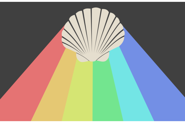
For this prompt I decided to create one of the classics of flat design: long shadows. You know what I mean... However, owing to the mystical nature of scallops I decided to make mine some kind of prism that would diffuse a rainbow from the skies.
Another choice I made was to make the light source that creates the rainbow not infinitely far. You see, flat design's long shadows have parallel edges, which could be created in nature if an object blocks light that comes from a light source that's infinitely far away (like, in a good approximation, the sun). If the light source is not infinitely far away though, the shadow edges won't be parallel any more, but are segments of lines that pass through the light source (hence intersect, and are not parallel).
Techniques
Drawing a shape from a photo
I'm no scallop expert, and I preferred to draw mine from an existing photo, namely this one.
Then here's how I usually proceed: I choose the Bezier tool (B) and place nodes along the border of the image I want to copy. Once done I have a curve that's made of line segments that follow roughly the shape I am drawing. I display the path with no border and a flashy semi-transparent background.

Once the first rough outline is done it's just a matter of selecting the Node tool (N) and going around the shape trying to match its border as closely as possible. I often soften nodes (Ctrl+Click on a node) to have smooth curves.

Note that sometimes it is quicker to vectorize a matrix object (Maj+Alt+B).
Drawing the shadow
Outlining
Once the shell was drawn and placed on the page, I placed a small circle out of the page, above the shell and drew two straight lines spawning out of the light source and just touching the shell. There should only be two such lines, one on the left and one on the right. With these two lines drawn, I drew a polygon that joins:
- the point of contact between the left line and the shell,
- the edges of the page enclosed between the two lines,
- and the point of contact between the right line and the shell.
With the position of the light source I chose, this shape is a 6-sided polygon (a hexagon), but with a farther light source it could be a 4-sided polygon (a tetragon), or with a light source that is more on the right or the left, it could be a 5-sided polygon (a pentagon)...
Dividing the shadow area
I then had to divide this polygon in six, as I had decided to draw a 6-color rainbow. However, all of the divisions must be larger on the bottom than on the top: they are effectively enclosed by lines that all pass through the light source, hence secant lines.
Here's how I proceed: I want the bottom line to be divided in six. To achieve this, I draw a copy of the bottom line, then using the Select tool (S) I lock the Length / Height ratio (optional for a line) and just divide the length by 6 (just write /6 after the length). Then I make six copies of the line and place them along the bottom line (turn on snapping for that). I then draw lines that connect the light source to the extremities of my six small segments, select one of the lines and the polygon, and divide the polygon (Ctrl+/) to part it along the line. That way, I divide the initial polygon in six small adjacent polygons.
Note: I made a mistake here, as I divided the bottom of the page in six. Instead, I should have continued both the base line of the page and the two touching lines until they cross, and divided that longer line in six. Oh well...
Choosing colors for a rainbow, the right way
HSV colors
To make up a palette for the rainbow, here's how I proceeded. What I wanted was to have kind of soft pastel colors. Instead of trying to choose six colors that would fit nicely together, I took advantage of the HSV color values. This system of colors, instead of RGB where you choose red, green and blue values has
- a hue measured in degrees from 0 to 360 which represents the apparent color,
- a saturation measured from 0 to 100 (or 1) which represents the intensity of color,
- a value, or brightness measured from 0 to 100 (or 1) which represents the apparent color if it is in darkness (low value) or lit by a strong source (high value).
This method was inspired by this interesting post.
Choosing colors, and subtleties
I chose the red tint as hsv = (0, 50, 90) and then just changed the hue for the other colors. The green for example is hsv = (135, 50, 90). I tried to have a regular gap in hue between the different colors.
Just dividing 360 in 6 and adding 60 in hue to all colors didn't give good results however: there was no real yellow and the high hue colors were too pink. So I decided to choose my highest hue color (blue with hue 225) and divide equally between those. However, I had to cheat a bit for the yellow, and chose a hue of 68 instead of 90, otherwise it would have appeared green.
Link to the svg
The original svg can be found here.
There are some drafts and pieces of construction around the page, that nicely illustrate what was presented here.